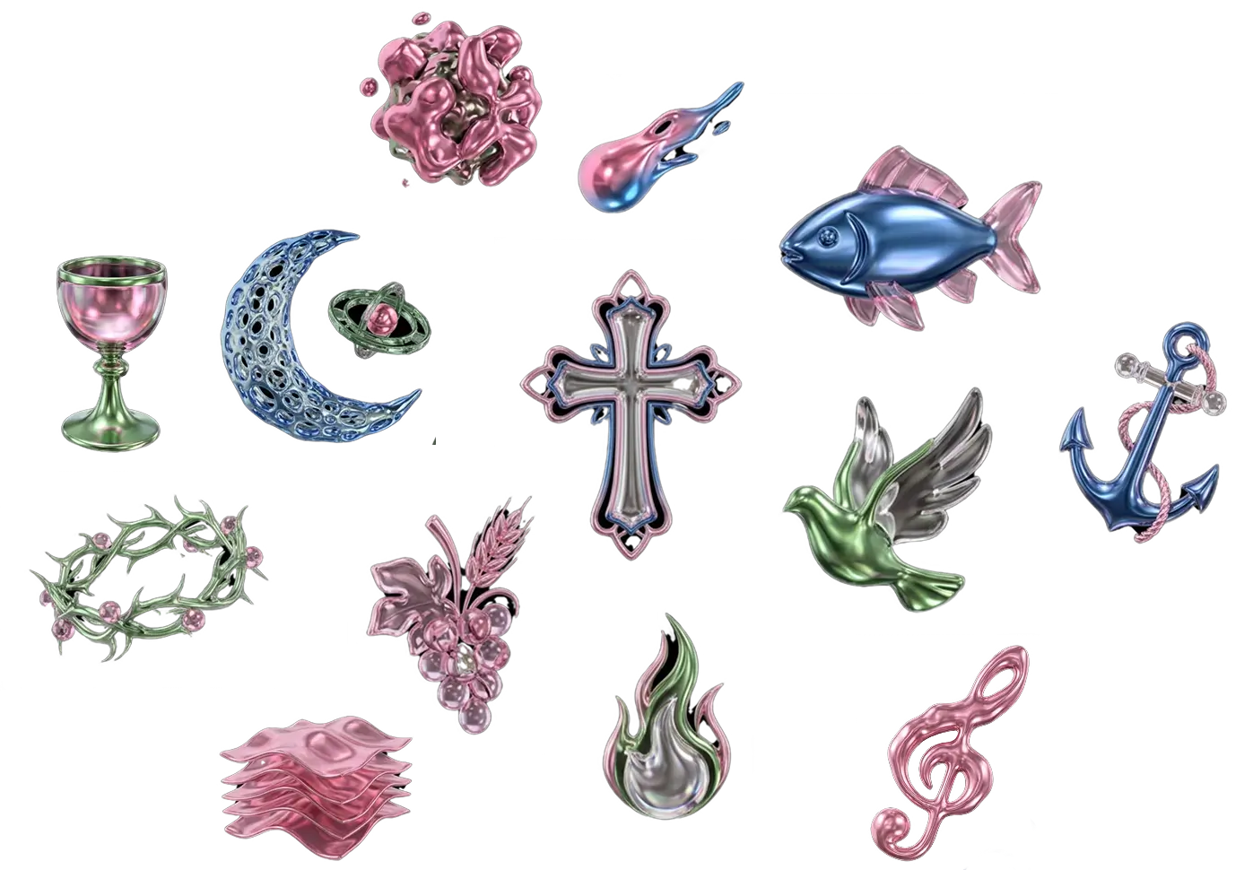
THE FULL SET💅🏻
Visual Identity, EP Rollout, and Website Design for Anna Thoresen
PROJECT OVERVIEW :
Anna Thoresen is an indie musician shifting from pop-rock into a more synth-driven era. I created a Full Set — a complete branding and visual identity system, including logo design and narrative-led campaign visuals, shaped around that transition.
CONCEPT :
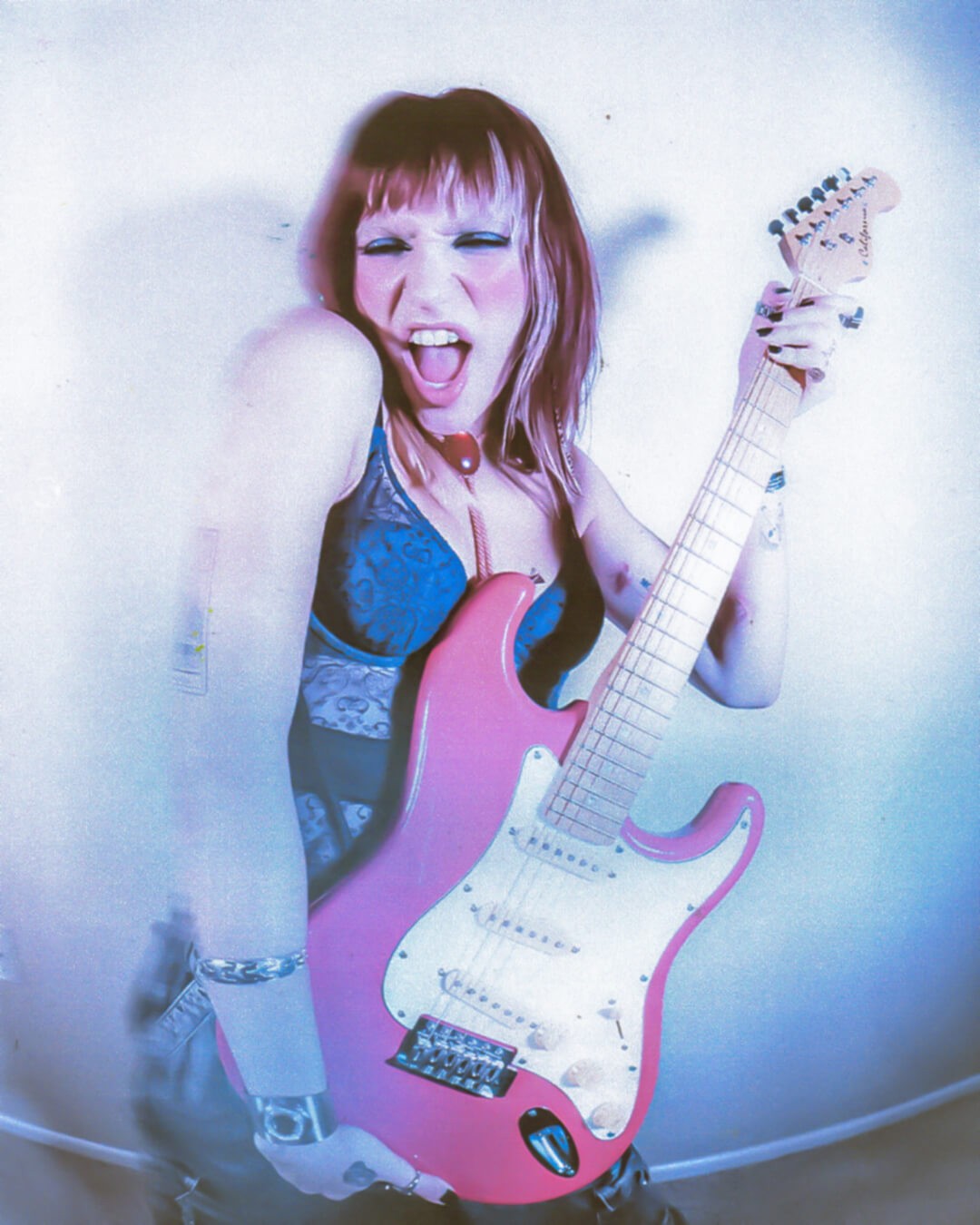
This project sits between two eras. It’s not a sudden change, but a gradual shift. The visuals stay connected, while becoming more playful and slightly surreal over time. Everything was designed to stay consistent, while still allowing the transition to happen naturally.

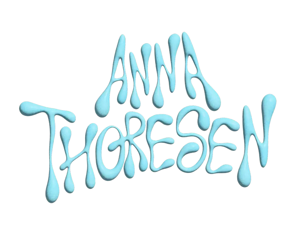
PRIMARY LOGO (CUSTOM LOGOTYPE)


SECONDARY LOGO

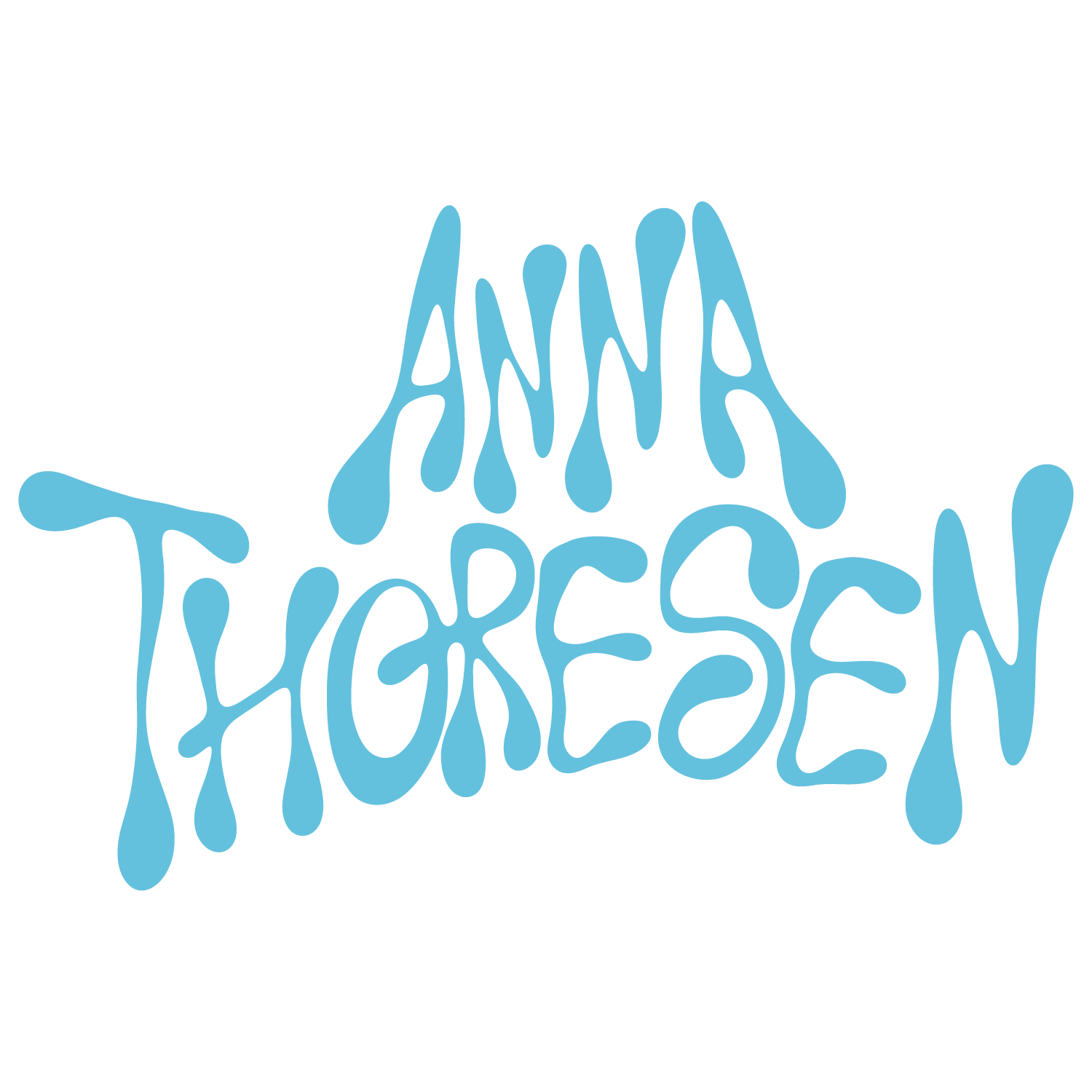
The secondary logo is used in more visually dense compositions where photography, textures, or collage elements take a stronger role in the layout. adding a little touch to the secondary logo to make it feel less generic.
COLOR PALETTE
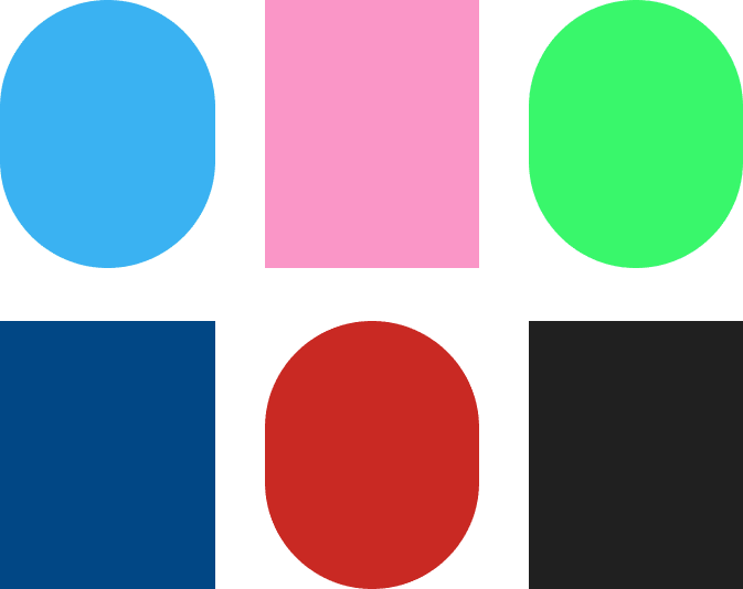
The palette mixes bold and vibrant colors with deeper tones to keep the visuals energetic but still balanced. Bright colors help bring a playful and expressive feeling, while the darker tones help ground the compositions and keep them visually clear. This combination supports the surreal and editorial style of the project, allowing the graphics to feel experimental while still staying cohesive across the campaign.
SOCIAL GRAPHICS AT GLANCE




WEBSITE